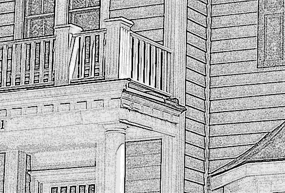
Here's another architect's website that's worth a visit. Genuine architectural patterns can be seen in almost every photograph...from the building forms themselves (scale, proportion, massing, etc.) to the smaller details (windows, columns, porches, etc.) that make up the carefully crafted exteriors. Also note how the houses (mostly new) seem to fit seamlessly into the environment in which they are built...timeless architecture!
www.fergusonshamamian.com
www.fergusonshamamian.com