Inspiration

Inspiration

Throughout this blog I've highlighted and created links to exceptional individuals and organizations who design thoughtful homes, environmentally responsible communities and historically based building products. Some of them are local to me, while others I've yet to meet. They are exceptional because at some point in their careers, be it a moment in time or countless hours spent around a conference room table, they decided to do what was right...even though their wallets might be fatter if they just followed the crowd. Their hard work and dedication to their chosen craft is now paying dividends in the form of homes and communities that will age gracefully and be admired for generations to come...and maybe even be an inspiration to others, like they were to me.

Thomas J. Ryan, Jr. - Architect

Like most of the internet, blogs read from newest to oldest entry...this one works best by reading the first three posts in chronological order, starting with the Welcome! post. Just scroll down on the right side of this page until you see the Blog Archive list...click on 2011, then scroll down to the bottom after the new page appears. Please email me with any comments and thanks for stopping by!

Thursday, August 2, 2012

Interior Shutters...


I took these photos while on a house tour in Williamsburg.  I always lag behind the group so I can take photos without people in them (an architect's hangup)...I can also "redecorate" a little for a better shot without the docents seeing me.

It's amazing, when in the open position, how much light these interior shutters can let in without the typical obstruction of curtains on the top or sides of the opening.  When the shutters are closed (as you can see in the bottom photo) they block out almost everything.


Tuesday, July 31, 2012

Exterior Wrap-around Shutters...


This is one of the coolest shutter applications I've ever seen.  It's in Williamsburg right on the main drag.  The shutters actually pull out and fold around each side the display window of this former silver shop...protecting the booty from the town dunk!

Below is a shot of the interior of the display window.  Notice how the shelves terminate at the wall...simple but effective design!


Thursday, July 26, 2012

Attention to Scale...


Ah, well done!...windows on the first floor should be taller than windows on the second floor.  Wall space from the top of the window to the ceiling should be the same from floor to floor.

Notice the proportion of the individual window panes as well...taller that wider looks best.

Tuesday, July 24, 2012

Approachable Porch...


All porches are not created equal...some are welcoming and some look like they were designed to keep people away...usually because of their height off the ground and overuse of brick or stone.  This porch is a great example of how to properly welcome your guests.

Notice the foundation...piers, not a massive stone or brick monolith.  Many homes have it exactly the opposite way...lots of brick or stone at the porch to impress the guests.

The proportions look good as well...the rectangular openings bounded by the floor, columns and beam should be more vertical than horizontal.

The only issue that jumps out at me would be that the short end of the porch (on the right side of the shot) usually looks better if it's held in fron the corner a bit...so the porch roof dies into the front wall of the house, not around the corner.

Thursday, July 19, 2012

Consistency Counts...


Any feature window shapes should be similar to one another but not overdone.  This architect chose an elliptical arch and used it for the porch, entry transom, upper hall and kitchen window (down the side of the house).

Tuesday, July 17, 2012

Exterior Materials...


Here is a great example of material restraint where the builder (this was built on spec.) didn't fall prey to the demands of the general public by adding full walls or patches of masonry here and there for curb appeal.

The body of the house (all four sides) is narrow exposure clapboard siding while stone can be seen at the house foundation and piers of the covered porch...totally appropriate to the setting.

Thursday, July 12, 2012

Find the Genuine Architectural Patterns...2


This week's photo is of a recently built house in my hometown of Naperville, Illinois. In this series I'll toggle between historic and new structures to show how genuine architectural patterns aren't just for "old" houses.  I'll pick out a genuine architectural pattern each day this week and explain why I think it's so good. No long-winded explanations...just the photograph, a highlighted detail and a short summary. Can you find any others?

Tuesday, July 10, 2012

Places - Seaside


Most houses in Seaside don't have garages, but the small number that do handle them beautifully.  Detached garages have advantages over their all too popular counterpart.  Here are four; natural light on all four sides of the house, side entry from driveway into house, possibility of garage attic living space, and a garage-less street elevation.

Thursday, July 5, 2012

Places - Seaside


Some of the most creative details at Seaside can be found where walls meet roofs.  Here is a simple, yet beautiful detail used to vent the house attic.  Attics are typically vented using ugly rectangular louvered vents.  Here it's handled artistically and probably costs less...ingeneous!

Tuesday, July 3, 2012

Places - Seaside


Another type of porch, like so many others in Seaside, is high in the sky...meant to take in beautiful Gulf sunsets.  These towers not only add character to the town's "skyline" but provide an interesting roof top vantage point when viewing the town from above.

It's sad how we build so many relatively tall residential structures with soaring rooflines but seldomly use the height to our advantage...the views can really be inspiring!


Thursday, June 28, 2012

Places - Seaside


Here is where it all starts at Seaside...genuine front porches based on simple but elegant architectural principles of design and construction.  The base of this porch was designed to act as one element supporting the entire porch, but is softened with 3 horizontal boards and paint to blend in with the house trim.  The column height combined with the relatively short guardrails give the otherwise small-ish house its commanding street presence.  Notice how the porch beam is clearly expressed and the stained porch beadboard is set to match the interior house ceiling.  An entry vestibule framed by an applied pilaster and pediment detail complete the welcoming entry.

Check out the photograph below I took in Alexandria Virginia of a historic home...similar vestibule.  I like how the architect of the Seaside house started with this idea but used it for a different purpose.  I'm just guessing here, but it seems like the entry vestibule allows visitors to approach the home without feeling as though they are invading the privacy of a covered porch right off a living space...used here like an outdoor extension of the room beyond.
 

Tuesday, June 26, 2012

Places - Seaside


Seaside Florida is one of the best places to see well done architectural patterns on new construction.  Situated on the Gulf of Mexico between Pensicola and Panama City this New Urbanist town is a great place to spend a relaxing summer vacation.  If you've ever wondered what a classic beach vacation might be like, look (and book) no further.  One of my favorite activities (and other architecture geeks) is simply strolling up and down the streets gazing at the beautiful homes and their genuine details.

I'll post some highlights this week...just don't tell too many people about it.

Thursday, June 21, 2012

Things that make you go hmmmm...5


This one is easy to spot...a semicircular porch arch and elliptical door transom...arch types need to match when used on the same house.  If the porch arch isn't necessary to make the door transom work then it should be flattened out.  The near passage of time will quickly date this detail to the McMansion-Age.

Tuesday, June 19, 2012

Things that make you go hmmmm...4


Four things here that could (and should) be better.  First, the material in the gable shouldn't match or be in the same line as the siding for the body of the house...it really makes the roof appear like it's been stuck-on (which it has).  Second, two uniquely shaped windows in one small space doesn't look so great...especially when the proportions are different.  Third, there is no historical precendent for framing a door with porch columns.  Lastly, and most importantly...a column is obviously missing from the left side of this shot...I know how the roof is being supported, but the porch couldn't look more out of balance...even to a non-architect.

Thursday, June 14, 2012

Things that make you go hmmmm...3


Close, but no cigar.  Here is a cantilevered wood frame chimney clad in thin stone.  A tall stone fireplace would be heavy, right?  Maybe need a foundation?  Yep, that's why this chimney looks fake (the bushes didn't trick me).

A simple solution to make this chimney look authentic would be to attach the thin stone to cement board (in place of the plywood sheathing) for the last 24", and run the stone and cement board 6" below grade...both materials will hold up to any moisture (which should drain AWAY from the house anyway) and look great for years to come.

Tuesday, June 12, 2012

Things that make you go hmmmm...2


Here is a cantilevered box-bay window clad with thin brick veneer.  Two things that jump out at me...most glaring is that the brick looks fake because it has no visible foundation...which would make it at least appear real.  Second, authentic bay windows with or without a foundation would never be clad in brick.

Thursday, June 7, 2012

Things that make you go hmmmm...


I've been looking forward to this series ever since I started the blog.  I'll start out by saying that everyone in the building community, including myself, (homeowners, architects, suppliers, builders, etc.) have been guilty at some point of dreaming of, selecting, drawing or building something that makes no sense.

My point is not to pick on any particular home, architect or builder...but to point out things that just aren't logical, and for the most part easily fixed.

The undersized (way too narrow) stock shutters pictured above do nothing to enhance this window detail...in fact, the house would look better if they were removed altogether.

Tuesday, June 5, 2012

Shutter details...louvers


Here is the "holy grail" of shutter design...a fun fact to really impress your friends after they tell you that your shutters have been designed or mounted incorrectly.  Genuine louvers should be angled toward the house in the open position so that water would flow away from the interior when closed.  It's very rarely done correctly, except by some of the very best architects...and smartest homeowners.

Thursday, May 31, 2012

Shutter details...tiebacks & locks


A classic example of tiebacks and a lock.  The tiebacks, secured to the wall or window sill, simply keep the shutters open by mechanical means.  There are many tieback designs available including 'S' hooks, rat tails and flowers.

Lock designs are more straight-forward, but their positioning is critical...even if you never intend to operate your shutters.  Notice on the above photograph how the shutter panels and lock are designed so that the homeowner could lift the bottom window sash, reach out to grab both shutters right below the check rail (where the top and bottom sashes meet...sometimes called the meeting rail) and slide the bolt to lock the shutters.

So when designing your next pair of shutters, make sure that the lock (or shutter rail that the lock would have been mounted to) can be mounted just below the check rail of your double hung window.

Tuesday, May 29, 2012

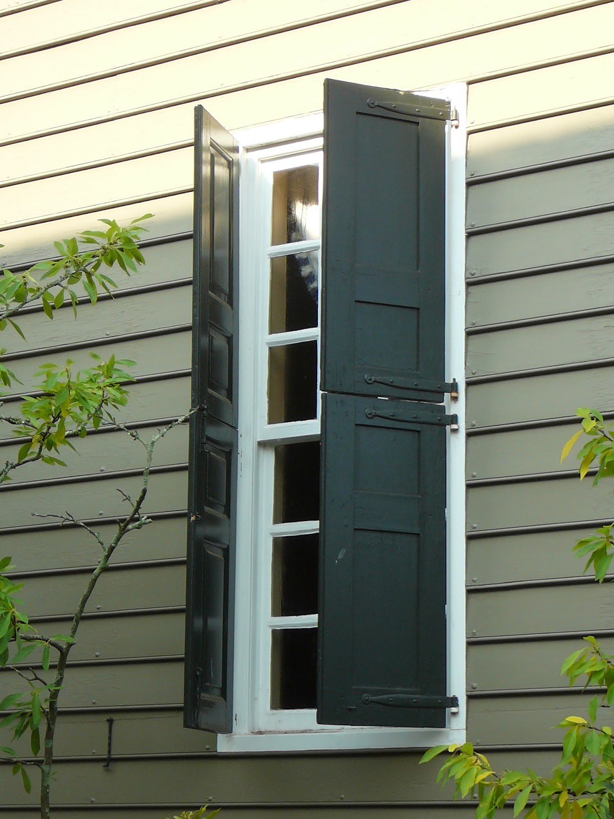
Shutter details...hinges


Here is a great example of hinged shutters...this one is really cool because the top and bottom half can be closed or opened independently.  Notice how the back side of the shutter (that would lay against the wall) is just the negative of the front, but provides some interest when in the closed position.