Inspiration

Inspiration

Throughout this blog I've highlighted and created links to exceptional individuals and organizations who design thoughtful homes, environmentally responsible communities and historically based building products. Some of them are local to me, while others I've yet to meet. They are exceptional because at some point in their careers, be it a moment in time or countless hours spent around a conference room table, they decided to do what was right...even though their wallets might be fatter if they just followed the crowd. Their hard work and dedication to their chosen craft is now paying dividends in the form of homes and communities that will age gracefully and be admired for generations to come...and maybe even be an inspiration to others, like they were to me.

Thomas J. Ryan, Jr. - Architect

Like most of the internet, blogs read from newest to oldest entry...this one works best by reading the first three posts in chronological order, starting with the Welcome! post. Just scroll down on the right side of this page until you see the Blog Archive list...click on 2011, then scroll down to the bottom after the new page appears. Please email me with any comments and thanks for stopping by!

Thursday, July 26, 2012

Attention to Scale...


Ah, well done!...windows on the first floor should be taller than windows on the second floor.  Wall space from the top of the window to the ceiling should be the same from floor to floor.

Notice the proportion of the individual window panes as well...taller that wider looks best.

Tuesday, July 24, 2012

Approachable Porch...


All porches are not created equal...some are welcoming and some look like they were designed to keep people away...usually because of their height off the ground and overuse of brick or stone.  This porch is a great example of how to properly welcome your guests.

Notice the foundation...piers, not a massive stone or brick monolith.  Many homes have it exactly the opposite way...lots of brick or stone at the porch to impress the guests.

The proportions look good as well...the rectangular openings bounded by the floor, columns and beam should be more vertical than horizontal.

The only issue that jumps out at me would be that the short end of the porch (on the right side of the shot) usually looks better if it's held in fron the corner a bit...so the porch roof dies into the front wall of the house, not around the corner.

Thursday, July 19, 2012

Consistency Counts...


Any feature window shapes should be similar to one another but not overdone.  This architect chose an elliptical arch and used it for the porch, entry transom, upper hall and kitchen window (down the side of the house).

Tuesday, July 17, 2012

Exterior Materials...


Here is a great example of material restraint where the builder (this was built on spec.) didn't fall prey to the demands of the general public by adding full walls or patches of masonry here and there for curb appeal.

The body of the house (all four sides) is narrow exposure clapboard siding while stone can be seen at the house foundation and piers of the covered porch...totally appropriate to the setting.

Thursday, July 12, 2012

Find the Genuine Architectural Patterns...2


This week's photo is of a recently built house in my hometown of Naperville, Illinois. In this series I'll toggle between historic and new structures to show how genuine architectural patterns aren't just for "old" houses.  I'll pick out a genuine architectural pattern each day this week and explain why I think it's so good. No long-winded explanations...just the photograph, a highlighted detail and a short summary. Can you find any others?

Tuesday, July 10, 2012

Places - Seaside


Most houses in Seaside don't have garages, but the small number that do handle them beautifully.  Detached garages have advantages over their all too popular counterpart.  Here are four; natural light on all four sides of the house, side entry from driveway into house, possibility of garage attic living space, and a garage-less street elevation.

Thursday, July 5, 2012

Places - Seaside


Some of the most creative details at Seaside can be found where walls meet roofs.  Here is a simple, yet beautiful detail used to vent the house attic.  Attics are typically vented using ugly rectangular louvered vents.  Here it's handled artistically and probably costs less...ingeneous!

Tuesday, July 3, 2012

Places - Seaside


Another type of porch, like so many others in Seaside, is high in the sky...meant to take in beautiful Gulf sunsets.  These towers not only add character to the town's "skyline" but provide an interesting roof top vantage point when viewing the town from above.

It's sad how we build so many relatively tall residential structures with soaring rooflines but seldomly use the height to our advantage...the views can really be inspiring!


Thursday, June 28, 2012

Places - Seaside


Here is where it all starts at Seaside...genuine front porches based on simple but elegant architectural principles of design and construction.  The base of this porch was designed to act as one element supporting the entire porch, but is softened with 3 horizontal boards and paint to blend in with the house trim.  The column height combined with the relatively short guardrails give the otherwise small-ish house its commanding street presence.  Notice how the porch beam is clearly expressed and the stained porch beadboard is set to match the interior house ceiling.  An entry vestibule framed by an applied pilaster and pediment detail complete the welcoming entry.

Check out the photograph below I took in Alexandria Virginia of a historic home...similar vestibule.  I like how the architect of the Seaside house started with this idea but used it for a different purpose.  I'm just guessing here, but it seems like the entry vestibule allows visitors to approach the home without feeling as though they are invading the privacy of a covered porch right off a living space...used here like an outdoor extension of the room beyond.
 

Tuesday, June 26, 2012

Places - Seaside


Seaside Florida is one of the best places to see well done architectural patterns on new construction.  Situated on the Gulf of Mexico between Pensicola and Panama City this New Urbanist town is a great place to spend a relaxing summer vacation.  If you've ever wondered what a classic beach vacation might be like, look (and book) no further.  One of my favorite activities (and other architecture geeks) is simply strolling up and down the streets gazing at the beautiful homes and their genuine details.

I'll post some highlights this week...just don't tell too many people about it.

Thursday, June 21, 2012

Things that make you go hmmmm...5


This one is easy to spot...a semicircular porch arch and elliptical door transom...arch types need to match when used on the same house.  If the porch arch isn't necessary to make the door transom work then it should be flattened out.  The near passage of time will quickly date this detail to the McMansion-Age.

Tuesday, June 19, 2012

Things that make you go hmmmm...4


Four things here that could (and should) be better.  First, the material in the gable shouldn't match or be in the same line as the siding for the body of the house...it really makes the roof appear like it's been stuck-on (which it has).  Second, two uniquely shaped windows in one small space doesn't look so great...especially when the proportions are different.  Third, there is no historical precendent for framing a door with porch columns.  Lastly, and most importantly...a column is obviously missing from the left side of this shot...I know how the roof is being supported, but the porch couldn't look more out of balance...even to a non-architect.

Thursday, June 14, 2012

Things that make you go hmmmm...3


Close, but no cigar.  Here is a cantilevered wood frame chimney clad in thin stone.  A tall stone fireplace would be heavy, right?  Maybe need a foundation?  Yep, that's why this chimney looks fake (the bushes didn't trick me).

A simple solution to make this chimney look authentic would be to attach the thin stone to cement board (in place of the plywood sheathing) for the last 24", and run the stone and cement board 6" below grade...both materials will hold up to any moisture (which should drain AWAY from the house anyway) and look great for years to come.

Tuesday, June 12, 2012

Things that make you go hmmmm...2


Here is a cantilevered box-bay window clad with thin brick veneer.  Two things that jump out at me...most glaring is that the brick looks fake because it has no visible foundation...which would make it at least appear real.  Second, authentic bay windows with or without a foundation would never be clad in brick.

Thursday, June 7, 2012

Things that make you go hmmmm...


I've been looking forward to this series ever since I started the blog.  I'll start out by saying that everyone in the building community, including myself, (homeowners, architects, suppliers, builders, etc.) have been guilty at some point of dreaming of, selecting, drawing or building something that makes no sense.

My point is not to pick on any particular home, architect or builder...but to point out things that just aren't logical, and for the most part easily fixed.

The undersized (way too narrow) stock shutters pictured above do nothing to enhance this window detail...in fact, the house would look better if they were removed altogether.

Tuesday, June 5, 2012

Shutter details...louvers


Here is the "holy grail" of shutter design...a fun fact to really impress your friends after they tell you that your shutters have been designed or mounted incorrectly.  Genuine louvers should be angled toward the house in the open position so that water would flow away from the interior when closed.  It's very rarely done correctly, except by some of the very best architects...and smartest homeowners.

Thursday, May 31, 2012

Shutter details...tiebacks & locks


A classic example of tiebacks and a lock.  The tiebacks, secured to the wall or window sill, simply keep the shutters open by mechanical means.  There are many tieback designs available including 'S' hooks, rat tails and flowers.

Lock designs are more straight-forward, but their positioning is critical...even if you never intend to operate your shutters.  Notice on the above photograph how the shutter panels and lock are designed so that the homeowner could lift the bottom window sash, reach out to grab both shutters right below the check rail (where the top and bottom sashes meet...sometimes called the meeting rail) and slide the bolt to lock the shutters.

So when designing your next pair of shutters, make sure that the lock (or shutter rail that the lock would have been mounted to) can be mounted just below the check rail of your double hung window.

Tuesday, May 29, 2012

Shutter details...hinges


Here is a great example of hinged shutters...this one is really cool because the top and bottom half can be closed or opened independently.  Notice how the back side of the shutter (that would lay against the wall) is just the negative of the front, but provides some interest when in the closed position.

Tuesday, May 22, 2012

Shutter details...sizes


Here is a photograph I took in San Antonio.  Look at how the shutters on the bay fit the windows...what a great example...closed for privacy on the second floor and opened on the first for light.


Shutter details...


Before windows, there were shutters...basically to keep things out...rain, wind, animals, people, prying eyes, etc.  Windows came along next...widely used in England starting in the early 17th century.  Still used to keep things out, but with one major advantage...natural light during daytime hours. 

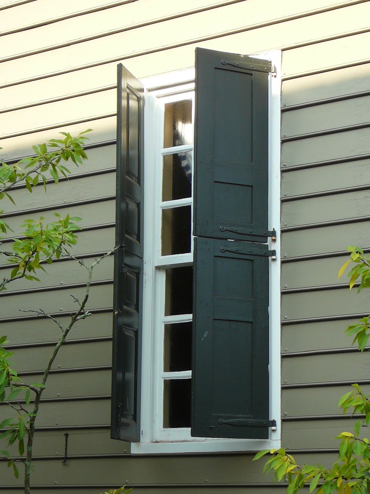
Shutters were now used for protective purposes on the first floor and privacy purposes if a second floor was present.  Sometimes you'll see, on the same house, paneled or board and batten shutters on the lower level (for better protection) and louvered shutters on the upper level (for better ventilation).

This week I'll review shutter details in order of importance the way I see it...first, get the size right...second, use hinges...third, use tiebacks and locks...and fourth, tilt louvers so they would shed rain away from the interior when closed.


Thursday, May 17, 2012

Shutters...


This one becomes really obvious once you start to notice how much of the world is filled with fake-looking shutters.  Shutters should be sized as though they would actually cover half of the window when and if they could actually close...more about that next week!

Tuesday, May 15, 2012

Window Sizes...


Here is a simple pattern to always put into practice...first floor windows should always be taller than second floor windows.

Thursday, May 10, 2012

Exterior Materials...


Following my "Big Concepts" post on January 11, 2012, "Use no more than two exterior materials";  this home uses only wood siding but changes the texture and color...a subtle, but classy move.  The gable is made up of lighter flush siding (to match the trim and entry) while the body of the house is classic clapboard siding, stained a darker color.

Tuesday, May 8, 2012

Simple Forms...


Following my "Big Concepts" post on January 3, 2012, "Simple forms are just the beginning"; three forms here...the two story main house, one story wings (probably additions) carefully designed not to overpower the original structure and finally a simple human-scale one story entry porch...no two story McMansion porch...just a beautiful honest structure designed to mark the entry and provide protection from the weather.

Thursday, May 3, 2012

Find the Genuine Architectural Patterns


So here's a new series I've developed as a good excuse to really take in many of the worthwhile details in a single photograph of a thoughtfully designed building...something that's often missed while flipping pages of a magazine or swiping through shelter apps like Houzz. Kind of like a "Where's Waldo" of genuine architectural patterns.

This week's photo is one I took while in Williamsburg Virginia. In this series I'll toggle between historic and new structures to show how genuine architectural patterns aren't just for "old" houses. I'll pick out a genuine architectural pattern each day this week and explain why I think it's so good. No long-winded explanations...just the photograph, a highlighted detail and a short summary. Can you find any others?

Thursday, April 26, 2012

Tuesday, April 24, 2012

Andrew Jackson Downing - Pattern Book


Andrew Jackson Downing (1815-1852) was a New York based landscape designer and prolific home designer.  His book, The Architecture of Country Houses, laid the groundwork for many pattern books that would follow.  He believed that everyone, rich or poor, deserved to live in a well designed house, and that the external appearance of that house could have the power to improve the lives of the occupants as well as those who would view it from the street.

I couldn't agree more!

Thursday, April 19, 2012

Art Institute of Chicago - Pattern Book Exhibition


Last Fall the Art Institute of Chicago put on an exhibition of pattern books...modern-day DIY manuals for building a house...geared to builders and carpenters rather than architects.  Most people would never guess that many of the charming historic homes they see lined up along America's quaint downtown streets were directly or indirectly influenced by this form of design.

The overview of the exhibition states that "For the middle-class clientele that could not afford an architect's services, a design selected from a pattern book would assure them that their new residence would be in good taste".  Ah, If only we could be so lucky with today's tract homes!

Tuesday, April 17, 2012

Arcosanti


I couldn't leave Arizona without visiting Arcosanti, located in the high desert about an hour north of Phoenix.  Founded in 1970 it's the lifelong dream of Italian architect Paolo Soleri, one of the original sustainable community guys.  Even though the dream of a large permanent community hasn't come to fruition yet, the residents that do call Arcosanti home (mostly artists, environmentalists & architects)make some of the most beautiful bronze and ceramic windbells in their on-site foundry...pretty cool, and worth the drive.

Thursday, April 12, 2012

Reinvention House Tour


Here's a shot I took of the last home on our tour designed by Jones Studio.  The materials take center stage when it comes to the use of genuine architectural patterns.  Locally source rammed-earth walls blend right into the desert sand and nearby mountains.  Check out the cleverly designed fencing...artistically placed rebar...the protective rusty layer will allow it to last for many years in the desert climate.  Here's a detail of the rammed-earth wall...placed in forms and left to set one "lift" at a time.

Tuesday, April 10, 2012

Reinvention House Tour


Here's a shot I took of the first house we toured, designed by Wendell Burnette Architects.  So does it have genuine architectural patterns?  You bet...here's four:  Lightly colored walls to reflect sunlight.  A thick roof and massive walls to slowly radiate the heat of the sun to the interior during cool desert evenings.  A large overhang designed to shade the massive glass wall from the overhead summer sun and invite it in during the winter when it's low in the sky.  And finally, my favorite...it's windowless sidewalls to intentionally screen out the neighbors' misplaced French Country, Georgian and Tuscan McMansions...just my opinion, of course!

Thursday, April 5, 2012

The Desert


Every now and then, in any profession, it's good to step outside your comfort zone to gain a new perspective on how others do what you do.  In my case, it was architects designing homes that relate and respond to the desert climate of Phoenix Arizona - quite different from the four season climate where I practice architecture.

Tuesday, April 3, 2012

Do Modern Homes have Architectural Patterns?


I spent a week last December in Phoenix, Arizona at a conference put on by Hanley Wood, called Reinvention.  This yearly gathering (held in a different city each year) draws residential architects from around the country interested in recharging their creative batteries with well organized, inspiring and thought-provoking programs. There are a variety of seminars and lively panel discussions as well as an all day housing tour - usually the highlight of the conference.

As I walked through each thoughtfully designed home I couldn't help thinking to myself...do modern homes have architectural patterns?
I'll share some of my thoughts this week...

Thursday, March 29, 2012

Institute for Classical Architecture & Art


If you are involved in any aspect of the traditional building industry and you are interested in networking with other like-minded professionals, you owe it to yourself to check out the Institute for Classical Architecture & Art.  There are fourteen Chapters throughout the Country, each with their own regional flavor and activities.  The organization is "dedicated to advancing the classical tradition in architecture, urbanism and their allied arts.  It does so through education, publication and advocacy." 


I've attended several events organized by my local group, The Chicago-Midwest Chapter, which have been excellent...I really look forward to chatting with fellow attendees before and after the presentations as much as the presentation itself.

Tuesday, March 27, 2012

Save any buildings lately?


At a Historic Preservation Workshop I attended in Chicago, Robert Myers, Planning Manager for the City of Urbana Illinois, gave one of the more entertaining and informative presentations I've seen in a while.  He wasn't just talking about what we could do to save endangered homes...he was sharing with us what he's already done.  House by house, year by year, he has methodically saved numerous historic houses from the wrecking ball.  Here are five strategies he outlined that might work in your town:

1. Hammer home the point to your local governing bodies that historic preservation is economic development.  Show them examples of how it's worked elsewhere.

2. Realize that a change in ownership is usually the only way to save an endangered (usually vacant) historic structure.  If the present owners really had any interest in saving the home from demolition, they probably would have already done so.

3. Cast a wide net to find potential buyers of historic homes that are in need of restoration.  Find out why people relocate to your town and where they are coming from.  Robert pointed us toward a really unique interactive tool that shows human migration patterns as assembled by the IRS using tax records from the year 2008.  He cited numerous examples of how someone's relocation decision actually started with them falling in love with a picture of a house.  Here's the link: (you might have to press "continue to site" in the upper right hand corner of the page that loads)


4. Convince owners of historic homes that their property is more valuable as a potentially contributing structure than just another piece of vacant land.

5. And finally, reintroduce the recently forgotten value of good old sweat equity.  Restorations are more manageable and affordable when broken down into smaller pieces...even over the course of many years, through different owners.

Thursday, March 22, 2012

"Must Read" Traditional Publications...


There's no need to wait until the next Traditional Building Show to get your fill of inspiring ideas and historically based building products.  These two oversized magazines, Period Homes and Traditional Building, published by Restore Media, will keep you well informed between the shows.  They are full of well written articles, useful advertising and of course lots of beautiful photographs.

Tuesday, March 20, 2012

Traditional Building Show


In the Fall of 2010 I attended the Traditional Building Show right here in Chicago.  It's got to be one of the best trade shows for anyone involved in designing, remodeling or building new homes in traditional styles...the kind of home where you can't tell if it's old or new!  I was mainly there to attend a workshop for members of Historic Preservation Commissions organized by the Illinois Historic Preservation Association.  During the workshop and various networking events (parties) I met lots of really interesting people...That's why I'm devoting this week (and maybe more) to my findings!  Stay tuned!

Thursday, March 15, 2012

Garage Doors


Whenever possible, two single, nine foot wide garage doors should be used in place of one sixteen or eighteen foot wide garage door. Narrow doors have more pleasing proportions and result in more car door opening space for the homeowner once inside the garage. Muellner Construction was the builder for this Historic District renovation in Naperville, Illinois.


More information on garage doors to come in future posts...

Tuesday, March 13, 2012

Columns


Columns come in many different shapes and sizes. Their proportion and scale should relate to the style of the house and should not be spaced too widely apart resulting in unnatural looking beam spans. The cap should always project past the face of the porch beam while the base of the column shaft should line up with the pier face below. Due to the taper of most columns, the outside face of the porch beam will not line up vertically with the edge of the deck below...don't worry, it will make sense when you see it on paper.


More information on columns to come in future posts...